Did you know that Visual Learners make up about 65% of the population? It’s true, but from time-to-time we still find ourselves sitting through horrid text-filled PowerPoint presentations and 100% orally-delivered lectures. Seriously. I once attended a philosophical talk about what could have been a fascinating topic. It turned out to be 45 minutes of Professor X READING his paper in front of 50 people.
I can tell you from personal experience that this type of presentation can be hard to focus on (especially for 45 minutes) and hard to remember after delivery (I have no idea what he was talking about).
Here are some things to keep in mind for your presentation or report.
1. Organize Text Graphically
Use bullet points and numbered lists, clear headings, and white space. By using these appropriately, your audience wont be intimidated by the work and will remember the information better since it is categorized.
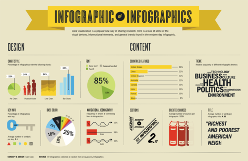
2. Use Images
I love when someone copy-pastes an essay into PowerPoint and calls it a presentation. Please don’t be that guy.
Create infographics to tell a story, use pictures to convey emotion, and generate charts/graphs to help people understand complicated concepts.
I recently used a LIVE POLL to generate data graphically. People love to see change in real time.
3. Body Language
The most convenient visual tool to use is ourselves. I could tell you that “a male platypus is 50-60 cm in length” or I could demonstrate it’s size with my hands! I could try to explain the steps to the Dougie, or these guys could show you.
I am one of the 65%. Keep me in mind the next time you have to deliver a message to the masses. Use these tips to SHOW people what you’re talking about and people will be more attentive and more likely to remember your message.
No comments:
Post a Comment